
Styling the Perfect Editorial Bookshelf: Proportion Rules, Art Vignettes, and Negative Space
The difference between a styled shelf and a storage shelf is rhythm, weight, and breathing room. Learn the 60/40 rule, horizontal stacks, leaned art, and the editor's step-by-step workflow.

Editor-in-Chief & Interior Stylist
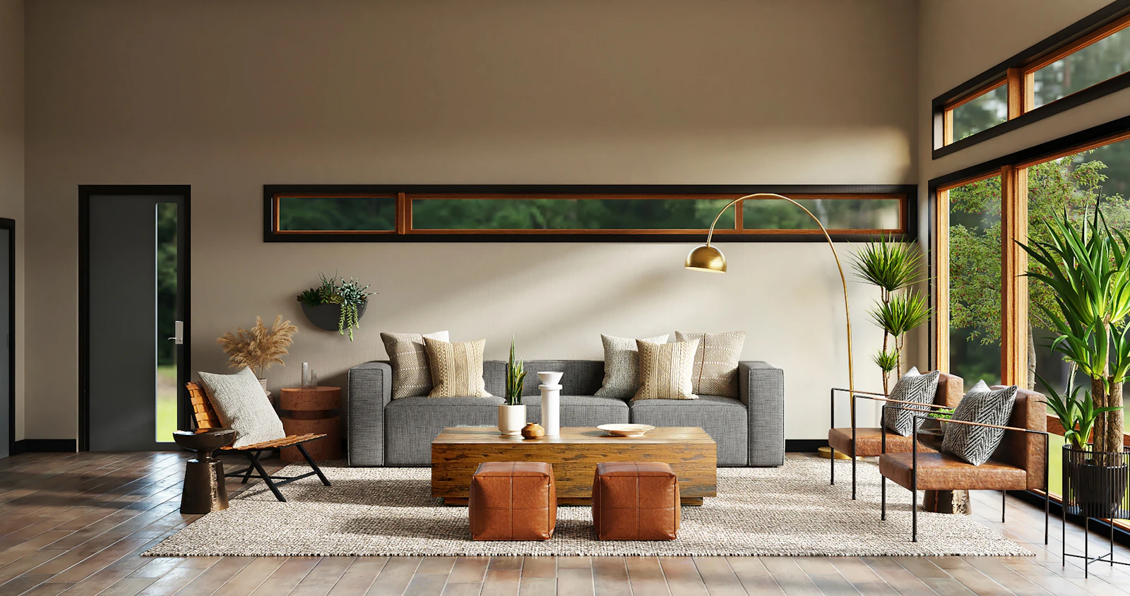
Curate a timeless editorial bookshelf with balanced book orientations, sculptural stoneware, and art vignettes. (Photo: Photo courtesy of The Decor Diary Editorial Studio)
Every home has one, and it is usually the most photographed corner of the room: the bookshelf. Yet there is a visible difference between a shelf that looks styled by an editor and one that simply holds books. The secret is rarely the objects themselves. It is rhythm — the way full and empty areas alternate — weight balance, and breathing room. A great shelf feels collected over years, even when it was arranged in a single afternoon.
The 4 Golden Rules of Bookshelf Styling
Before you buy a single vase, learn these four proportions. They are the same rules stylists use on magazine shoots, and they work on a $40 flat-pack bookcase as well as on custom built-ins.
Rule 1: Follow the 60/40 Composition
Aim for roughly 60 percent filled space and 40 percent negative space on every shelf. That empty 40 percent is not wasted — it is what lets the eye rest and makes the objects you do display feel important. If a shelf feels cluttered, do not rearrange it — remove a third of what is on it. Styling is mostly editing.
Rule 2: Alternate Vertical Rows with Horizontal Stacks
A shelf of nothing but upright books reads as a library wall — handsome, but static. Break the rhythm by alternating: a vertical run of books with matching-height spines, then a horizontal stack of three or four large art books, then open space. Top each horizontal stack with a single object — a small sculpture, a brass candle holder, a stone. The stacks act as pedestals and side tables inside the shelf, and they are where your favourite objects earn their spotlight.
Rule 3: Lean Art, Then Layer in Front
The fastest way to make a shelf look editorial is to lean a small framed print or photograph against the back panel, behind your objects. The frame adds a backdrop and instant height. Then place something low and rounded in front of it — a ceramic bowl, a woven basket, a stack of two books — so the shelf has three depths: art at the back, books in the middle, a soft shape at the front. Depth is what separates a vignette from a row.
Rule 4: Group Objects in Threes, at Different Heights
Odd numbers read as intentional; pairs read as accidental. Group objects in threes with clearly different heights — tall, medium, small — such as a vase at 10 inches, a candle at 6, and a small bowl at 3. Think of each group as a tiny skyline. Keep one material family in charge per group (ceramic, brass, wood, glass) so the trio feels related rather than random.
A Step-by-Step Styling Workflow
- Empty everything. Wipe the shelves and sort books by size and color family on the floor.
- Anchor with the biggest books first. Place large art and design books in vertical runs on the lower shelves, where visual weight belongs.
- Build your horizontal stacks. Three or four books each, spread across different shelves and heights — never all on one level.
- Add the art. Lean frames at the back of two or three shelves, slightly off-center.
- Place your trios. One object group per shelf section, following the heights rule, then step back and check the 60/40 balance.
- Edit once more. Remove one thing from every shelf. This final subtraction is the step beginners skip and editors never do.
Choosing a Palette and Materials
A shelf photographs well when its colors echo the room. Pull two or three tones from your sofa, rug, or artwork and repeat them in book spines and objects: warm terracotta, aged brass, and creamy ceramic, for example, or black, white oak, and glass for a cooler scheme. If your books are a rainbow, wrap the loudest spines in linen book cloth — a ten-minute trick stylists use constantly. Mixed materials matter more than matching ones: pair something rough (stone, woven seagrass) with something smooth (glazed ceramic, polished metal) in every grouping.
Bookshelf Mistakes to Avoid
- Filling every inch. A shelf with no negative space looks like storage, not styling. Empty areas are a design choice, not a failure.
- Pushing everything to the back. Objects lined up against the back panel look flat. Pull books and objects toward the front edge so light and shadow create depth.
- Identical heights in a row. A row of same-height objects reads as a fence. Vary heights or break the line with a stack.
- Too many small things. Five tiny trinkets have less impact than one confident object. Scale up: on a standard 12-inch-deep shelf, at least one object per section should be 8 inches or taller.
Bookshelf Styling FAQs
How many books should stay on the shelf?
Keep the books you genuinely love or use, arranged by size and tone. Overflow belongs in closed storage. Most styled shelves are roughly half books, half objects and air — if yours is 95 percent books, it is a library, and that is fine too, as long as the rows are broken by a few stacks.
Should book spines face out or be hidden?
Spines out is the honest, classic choice. Turning books around for a uniform cream look photographs beautifully but makes finding a title impossible — save it for a guest room shelf, not your everyday collection.
How do I style very deep or very tall shelves?
Deep shelves need the depth treatment: art or a tall object at the back, books pulled forward. For tall openings over 16 inches, add a horizontal stack plus a tall vase to fill the vertical space, or install a small picture light above the opening.
A styled bookshelf is never really finished — it absorbs a travel souvenir here, a new novel there. That is the point. Start with the proportions, keep the breathing room sacred, and let the shelf grow up slowly around the rules.
Shop The Look • Hand-Selected Room Pieces
 Best SellerTarget
Manage inventory, stock, sales, purchases, suppliers and business reports with MBI Inventra. Smart inventory management and POS software for pharmacies, wholesalers and retailers.
* The Decor Diary editors independently select all featured products. We may earn an affiliate commission on qualifying purchases made through our verified merchant links.
Editorial Standards & Fact-Checking
This guide was researched, written, and verified in accordance with The Decor Diary’s editorial principles. We test room solutions for practicality, longevity, and sustainability.
Read our full editorial workflow →Written by Elena Vance
Editor-in-Chief & Interior Stylist
Elena Vance has over twelve years of experience in interior architectural design and editorial styling. Her philosophy centers on organic minimalism, textural layering, and making residential spaces effortlessly tranquil.
View all articles by this author →Community Conversation (0)
Share Your Thoughts
Have a question about this decor layout or a tip of your own? We welcome civil, thoughtful discussion.
Related Design Stories
Beautiful Balcony Decor Ideas for a Relaxing Outdoor Space
Transform your balcony into a cozy and relaxing retreat with beautiful plants, comfortable seating, and warm lighting. These simple decor ideas are perfect for creating a stylish outdoor space.
15 Cozy Boho Reading Nook Ideas to Create a Relaxing Corner
Create a cozy reading corner with warm lighting, indoor plants, comfortable seating, and beautiful boho decor.

Curtains That Make the Room: Length, Fullness & Hanging Height, Explained
Too short, too skimpy, hung too low — most curtain disappointment is a measurement problem. Learn the three numbers designers swear by: rod height by the ceiling, hem length by the floor, and fullness by ratio.